 Models
In the ‘ Models’ view, you can access information
related to your trained models.
The top-level view contains an overview of all models and their performance.
By selecting a model, you can access information about the model and all trained features in the model view.
By selecting a feature, you can access information on the feature and performance in the feature view.
Top-level View
The top-level view consists of three components:
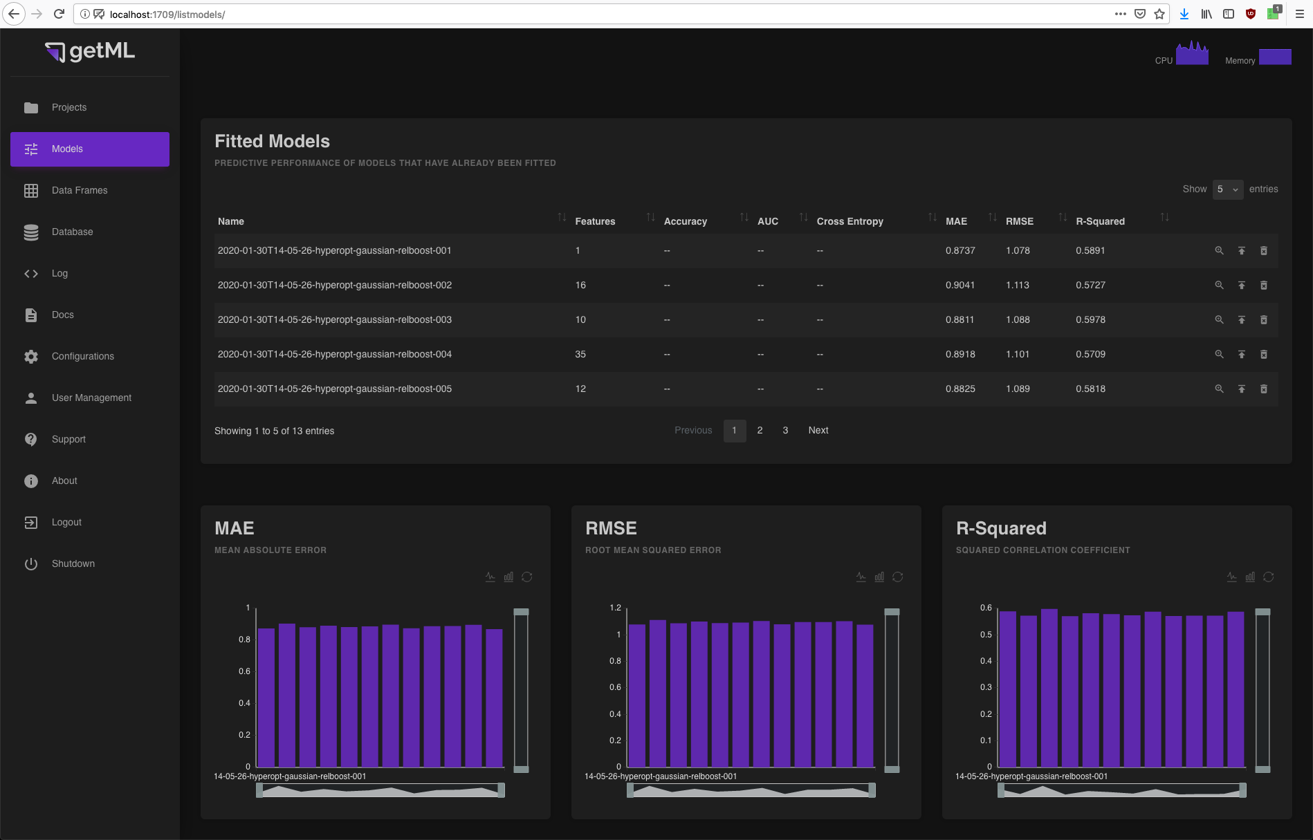
A table containing all fitted models including their performance and several icons triggering operations on the models.
Three score plots displaying the performance of all trained models with respect to a specific score as either a bar or a line plot.
A table containing all deployed models.
Fitted Models
This table contains all models of the current project
that have already been fitted (by calling their
fit() method).
If you have not called the score()
method on a model, the table will only contain its number of features and
its name. The performance scores will refer to the dataset on
which you have last called score().
You might notice that the score()
routine only calculates three out of six scores. This is because
accuracy,
auc, and
cross_entropy are only supported for
classification problems
and mae,
rmse, and
rsquared are only supported for
regression problems.
More information about the particular scores can be found
in the doc strings in the scores module.
In addition, you have three icons at the end of each column enabling you to do the following:
 Access more detailed information about the
model via the model view.
Access more detailed information about the
model via the model view. Deploy the model and make it accessible via an HTTP(S)
endpoint (see Deployment for details). All deployed models
will be listed in a dedicated table.
Deploy the model and make it accessible via an HTTP(S)
endpoint (see Deployment for details). All deployed models
will be listed in a dedicated table. Delete the model (Warning: this step
can not be undone).
Delete the model (Warning: this step
can not be undone).
Score plots
The three scores calculated during the call to the
score() method as described in the
previous section are displayed as either
bar or line plots. You can switch between the bar and line view using
the icons in the top right corner below the plots heading. The
models are sorted alphabetically.
 icon’.
Model View
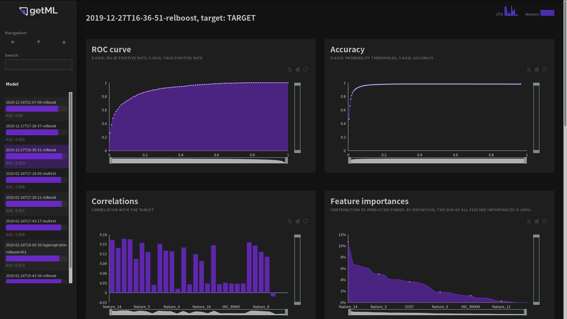
The model view can be accessed from the top-level view of the ‘ Models’ tab by
either clicking the name or the symbol in the row of a
particular model in the Fitted Models
table. It consists of the following plots and tables:
The ROC curve (for classification problems)
The Accuracy plot (for classification problems)
The Correlations and Importances plot containing the correlation of each feature with the target variable and their corresponding importances
The Features table providing an overview of all selected features
The hyperparameters for the both feature engineering algorithm and the predictor
The data model used
ROC curve
The ROC curve plots the true positive rate against the false negative
rate as explained in detail in auc.
Note that this curve is only visible for classification problems.
The displayed white points are sampled (it is not wise to load the entire curve into the frontend).
Accuracy
The accuracy curve is generated by first calculating the
probabilities for each sample in the population table. These
probabilities are the same probabilities you get when you call
using predict(). The
accuracy is calculated by dividing the
number of correct predictions for different probability thresholds
by the overall number of prediction.
The value of the accuracy displayed in the Fitted
Models table or returned when calling the
score() method of a
models instance is the peak of the accuracy curve.
Note that this curve is only visible for classification problems.
The displayed white points are sampled (it is not wise to load the entire curve into the frontend).
Correlations and Importances
These two plots depict the correlation between the features and the target variable as well as their importances.
The feature importance is based on the predictor. Feature importances are normalized: All feature importances add up to 100%. They thus measure the contribution of each individual feature to the overall predictive power. The area under the feature importances curve can be interpreted as predictive power.
The features in both plots are sorted by feature importance.
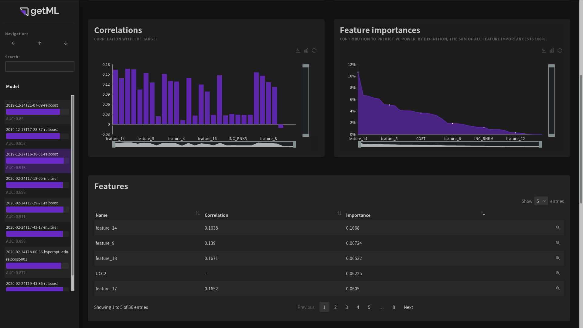
Features table
The features table provides an overview of all features, both automatically engineered and raw columns from the population table.
By clicking either the name of a feature or the icon at
the end of a column, you can access the feature
view displaying more
information on the feature.
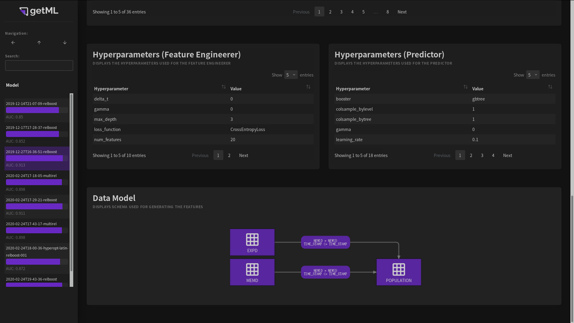
Hyperparameters
The hyperparameters tables list all parameters of both the feature
engineering algorithm (see either MultirelModel
or RelboostModel) as well as the predictor (see
predictors) used during training and scoring. By
hovering over a parameter, you can view a short explanation.
Data model
A graphical representation of the Data model used in the trained model.
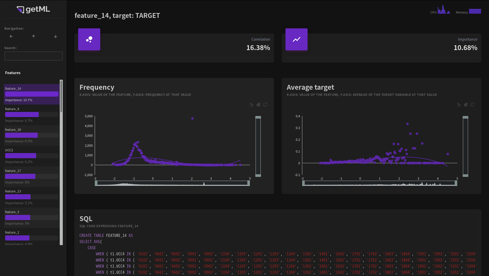
Feature View
The feature view can be accessed from the model view by either clicking a feature’s name or the
symbol in the
Fitted Models table.
It contains information on the individual features. Features can be one of the following:
Raw columns from the
DataFrameprovided as the population table inscore().Automatically generated features created by the automated getML’s feature engineering algorithms. Automatically generated features have names like feature_1.
An automatically generated feature - a set of aggregations and conditions applied to the original data set - is represented in two different ways:
First, in the form summary statistics of the resulting values in the Frequency and Average target plots.
Second, in the form of SQL code. Please note that the SQL code is only meant to get an idea about the nature of the feature and may not be a valid SQL expression for your particular database system.
Frequency plot
The frequency plot is calculated as follows:
The algorithm creates 200 equal-width bins between the minimum and maximum value of the feature. The y-axis represents the number of values of the feature within one bin. The x-axis represents the average of all values within this bin (as opposed the minimum, mean, or maximum of the bin itself).
Thus, all resulting points are located on the unnormalized version of the empirical PDF (probability density function).
Note that bins which contain no value at all won’t be displayed.
The frequency plot is always based on the data that you used the last
time you called score(). If you haven’t
called score() on this model before,
the plot is not displayed.
Average target plot
This plot uses the same bins as for the Frequency plot. For all values within each of these bins, it calculates the average value of the corresponding target variable.
Note that bins which contain no value at all won’t be displayed.
Like the frequency plot,
the average target plot is always based on the data that you used the last
time you called score(). If you haven’t
called score() on this model before,
the plot is not displayed.