 Data frames
In this view, you can access information related to your
imported DataFrames.
The top-level view contains an overview of all data frame objects in the engine as well as their size and memory usage.
By selecting a data frame, you can access the data frame view.
By selecting a column in the data frame view, you can access the column view.
Top-level view
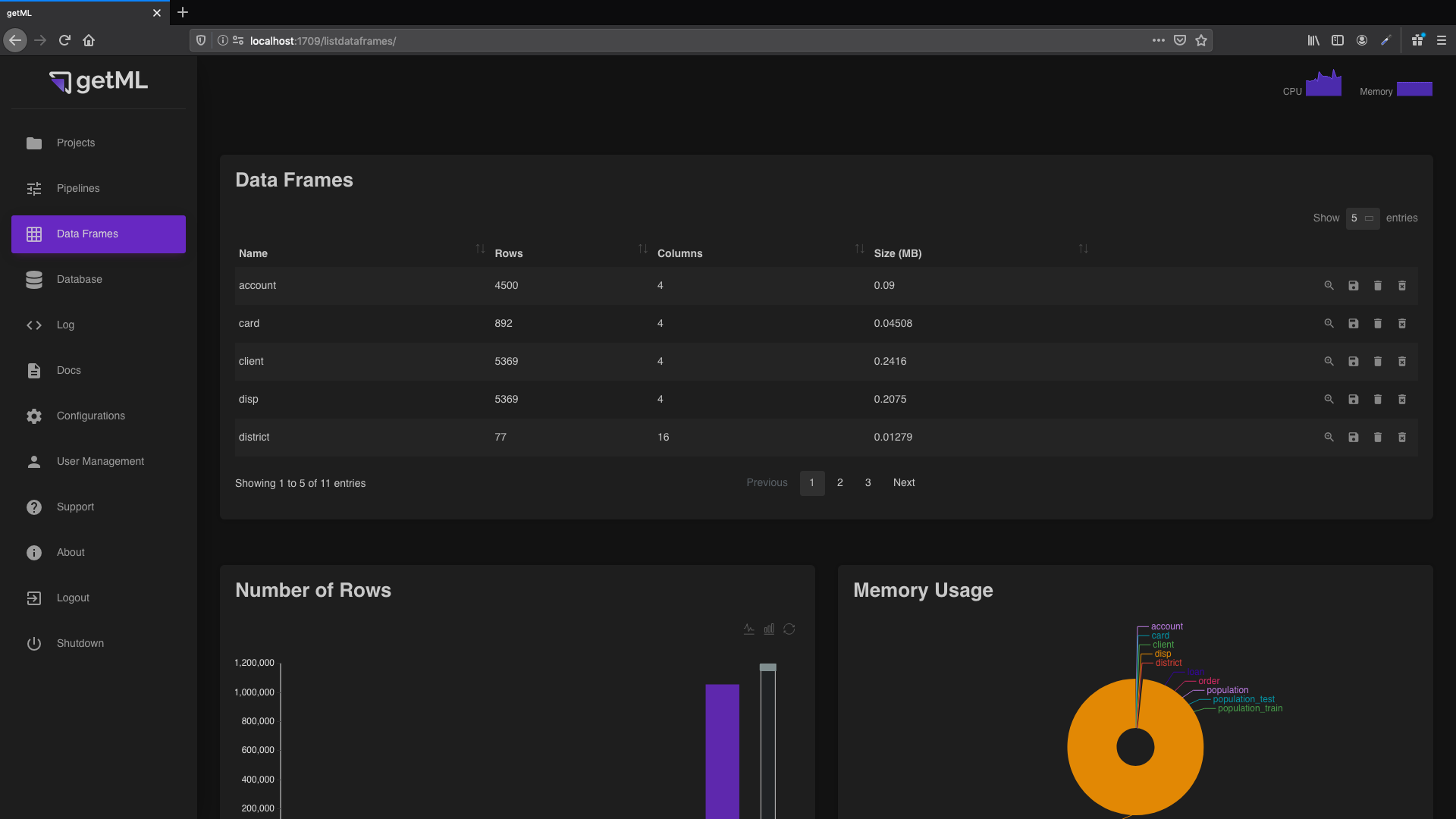
The top-level view of the ‘ Data Frames’ tab
consists of two plots. The first plot compares the numbers of rows.
The second plot compares the memory used by the data frames. The
top-level view also contains the ‘Data Frames’ table which contains
a general overview of all
imported DataFrames.
In addition, you have four icons at the end of each column enabling you to do the following:
 Get more detailed information about a data
frame via the data frame view.
Get more detailed information about a data
frame via the data frame view. Write the content of the corresponding data frame to disk.
 Removes the data frame from RAM. Note that, when
saving its content to disk first, the data frame can be restored by
loading it into memory again (see
Lifecycle of a DataFrame).
Removes the data frame from RAM. Note that, when
saving its content to disk first, the data frame can be restored by
loading it into memory again (see
Lifecycle of a DataFrame). Delete a data frame object from
both RAM and disk (Warning: this step can not be undone).
Delete a data frame object from
both RAM and disk (Warning: this step can not be undone).
Note that the statistics for the memory consumption only include the raw data, but do not include the indices which are automatically created on all join keys.
Data frame view
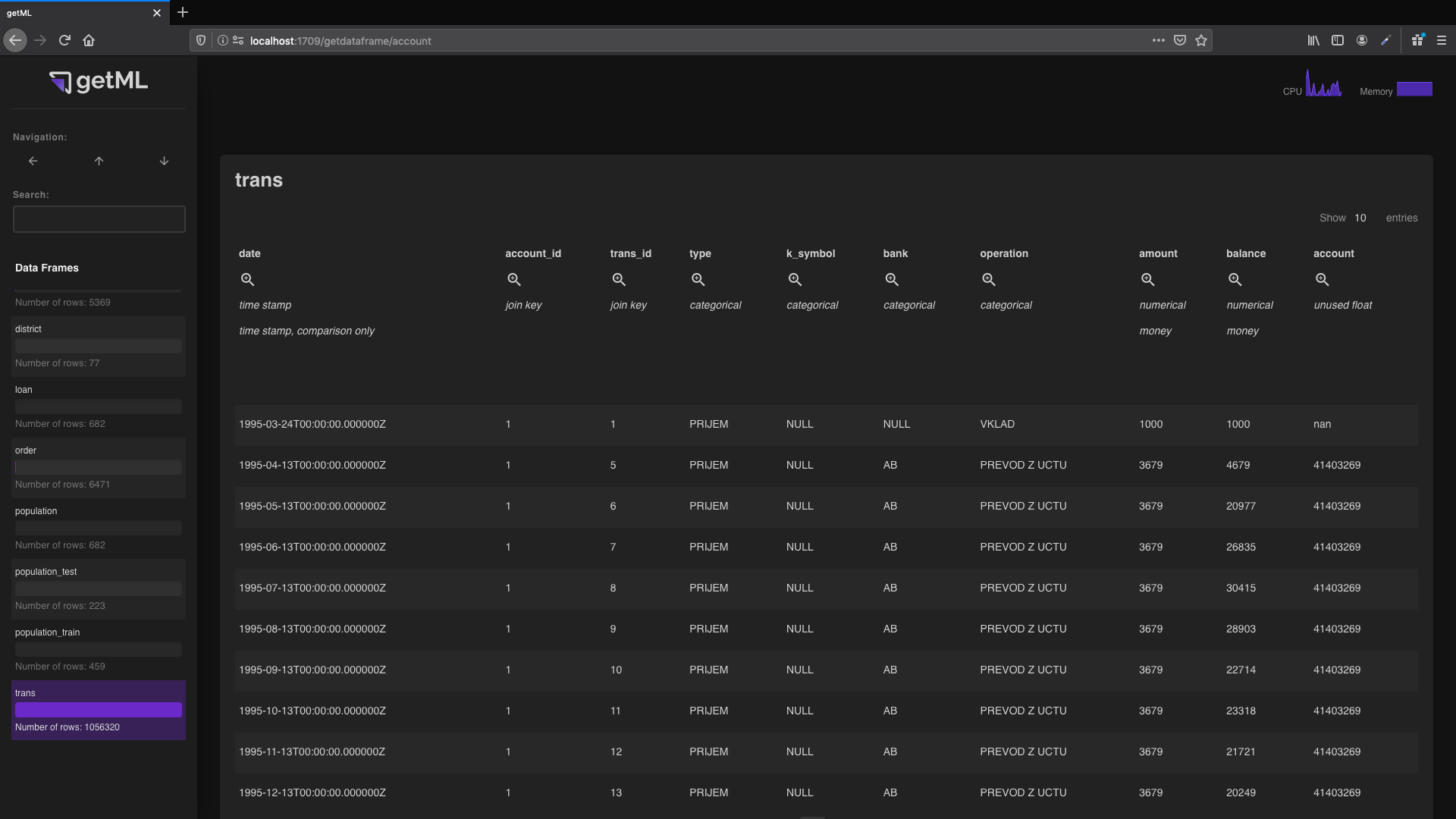
The data frame view can be accessed from the top-level view of the ‘ Data Frames’ tab by
either clicking the name or the symbol.
The body of the table contains the raw content of the data frame. The table head
contains additional information about the annotation.
The icon
redirects to the column
view. Below the icon you can see
the role and unit
of the column.
Column view
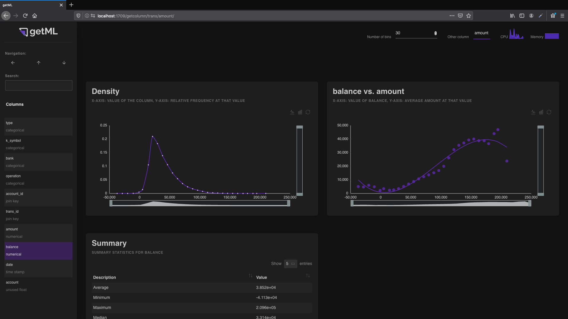
The column view can be accessed by clicking either the name of a
column or the icon in the heading of a column in the
data frame view. It contains
information on the column:
The ‘Summary’ table displaying various summary statistics of a variable.
Density plot
The binning in the
frequency plot behaves differently for numerical and
categorical data. If a column’s role is
numerical,
time_stamp,
target, or
unused_float, it contains numerical data.
If a column’s role is categorical,
join_key, or
unused_string, it contains categorical data.
For numerical data, the range between the maximum and minimum value is split into bins. The number of said bins is determined by the “number of bins” input in the topbar. Bins containing no values will not be displayed in the plot.
The x-axis of the frequency plot represents average of all values within the bin (as opposed to the minimum, mean, or maximum of the bin itself).
The y-axis of the frequency plot represents the share of values within the bin.
Thus, all resulting points are located on the normalized version of the empirical PDF (probability density function).
For categorical data, each category is used as a bin (containing only a single value) if the number in “number of bins” is greater or equal than the total number of unique categories. The resulting bins are then sorted according to the frequency of the corresponding category.
If the number of bins is smaller than the total number of categories, the categories are sorted by frequency and then distributed as evenly as possible into the bins.
The x-axis represents the categories or bins.
The y-axis represents the frequency.
Relation plot
You can use the relation plot to plot the current column against
another column containing numerical data (numerical,
time_stamp,
target, or
unused_float). The other column is selected in the
drop-down menu in the “Settings” box.
For numerical columns, the curve is calculated as follows:
The binning is the same as in the previous section. The y-axis represents the average value of the other column for all values within the bins.
For categorical columns, the curve is calculated as follows:
For each unique value, the algorithm calculates the average value of the other column. The values are then sorted by these averages. If the number of unique values is greater than the number of bins, the values are distributed as evenly as possible into the bins.
The plot displays the accumulated frequencies of the sorted values on its x-axis and the average values on the y-axis.
This gives you an indication of how well the string column separates the other column.